
Solo Metrics Dashboard · Teams under ten
Right now you cannot tell which. These customer service metrics for small teams (eight numbers, tracked for twelve weeks) will tell you, in five minutes a week, before a slipping number becomes a customer who never comes back.
Instant download · Excel, Sheets & LibreOffice
Secure checkout · instant download.
The problem
Customer service is the part of a business that scales last, and the part a customer feels first. When you are small, it runs on personal effort and good intent, and it works, right up until the day it quietly stops.
The customer who waited too long for a reply does not complain. They just do not come back, and they do not tell you why.
That is the gap this dashboard closes. Measurement is not about turning your work into a spreadsheet. It is about making the invisible visible early enough to act, while a slipping number is still a five-minute fix and not a lost quarter.
Why eight, not twenty-four
A larger operation tracks two dozen metrics because it has a team to act on them. You do not, and you should not pretend otherwise.
These eight helpdesk metrics (or customer support metrics, whichever you call them) are the numbers a team under ten can actually move. They are not a stripped-back version of a bigger dashboard. They are the right-sized instrument for the operation you actually run.
What you get
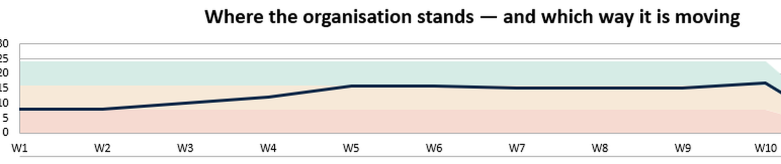
Email response time is the number small teams get wrong most often. Type this week’s figure and the band appears beside it. Twelve weeks later you can see the trend, not just the number.
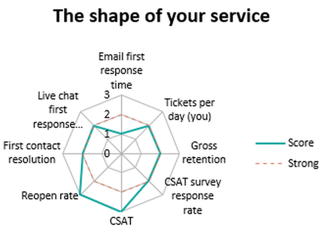
Eight charts, one per metric, with the bands shaded behind each line, plus the radar above, which shows in one glance which pillars are dented and which are strong.
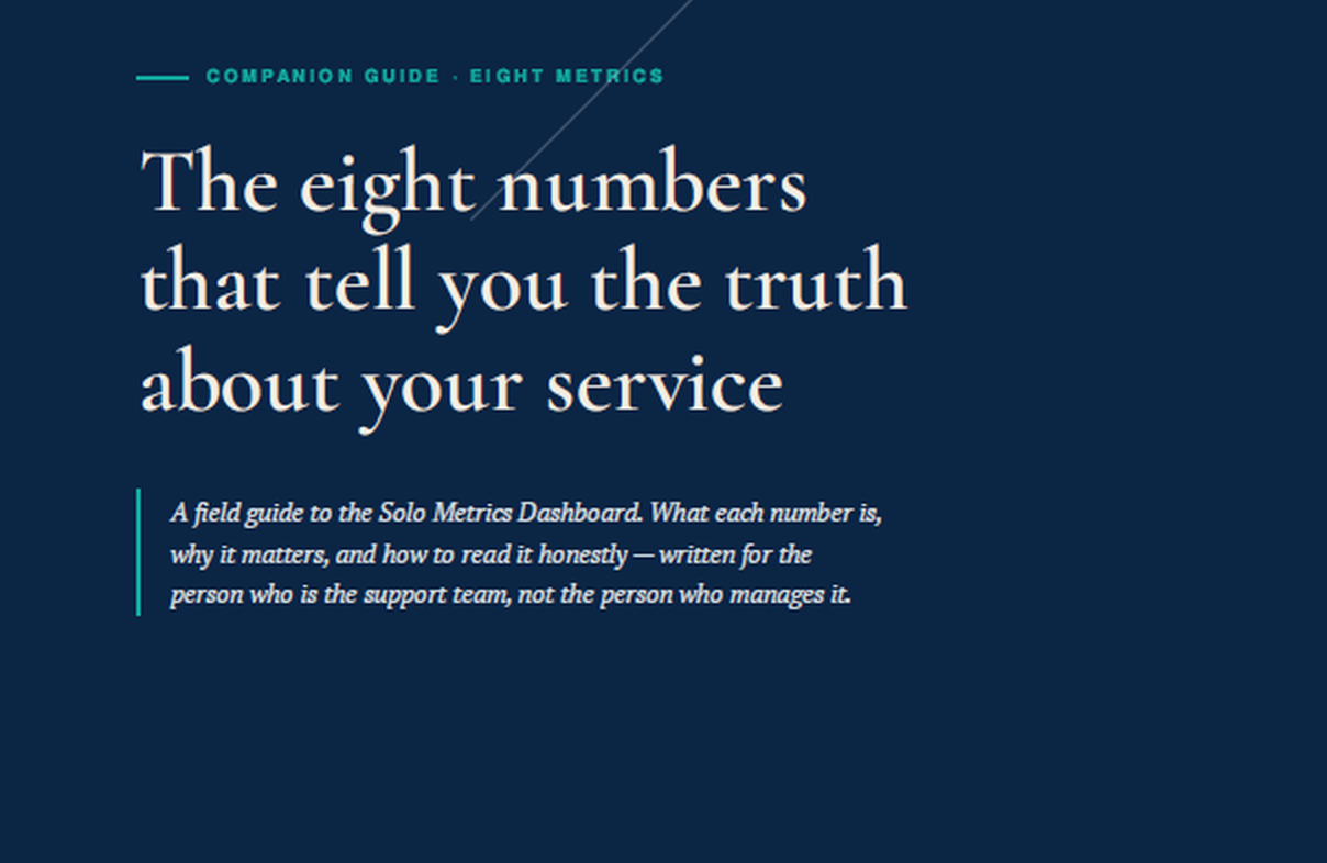
What each metric actually measures, why it matters at your scale, and how to read it without fooling yourself. Each page ends in the customer’s voice.
See it properly
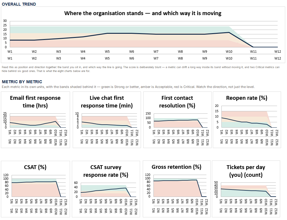
Not a mock-up. This is what opens when you click Visual: the overall trend across the top, then every metric on its own chart with its bands shaded behind it.
Why these eight
We run multilingual customer service operations for clients around the world. Across those years and those markets, a pattern holds: an operation under ten people is won or lost on a small number of things, and the rest is noise you cannot afford to chase.
Choosing these eight is our judgement. Where the bands sit is not: those are benchmarked, then filtered for organisations your size rather than a mid-market average that quietly puts the bar in the wrong place.
One thing you only notice running operations across several markets at once: customers in some regions rate identical service three to seven points lower than others. The bands account for it, so you are not chasing a number that was never yours to hit.
What you are buying is not the numbers. It is knowing which eight to watch, and what “good” honestly looks like when you are the support team.
How it runs
The real objection is not the price. It is that you will fill this in once and never open it again. So the routine is built to survive a bad week.
Eight numbers. Leave any that do not apply at your scale blank: a blank is honest information, not a failing.
Strong or better, protect it. Acceptable, no advantage either way. Critical likely means you are losing customers and do not yet know it.
They do the thinking. You are not reading this week’s number, you are reading which way the line is heading.
Same five minutes. Your only job is to keep the numbers honest.
Honesty about fit
We would rather lose the sale than have you open the file and find it does not fit your operation.
The guarantee
Thirty days. No form, no argument, no “what went wrong?” survey. One email and the money goes back.
And you keep the files. We cannot claw a PDF back off your hard drive and we are not going to pretend otherwise. We would rather you kept a good opinion of us.
We can afford to say this because the product is good and because your €49 is not the point. If the eight numbers work, one day you will need twenty-four, and the SME Dashboard will be there.
Before you buy
Both, and LibreOffice. It is an .xlsx file with no macros and no add-ons. Open it wherever you already work.
Leave them blank. The dashboard is built for it, and the guide says so explicitly: a blank is honest information, not a failing. Most teams under ten leave one or two blank.
No. If you have a helpdesk tool, the numbers are easier to find: most of the eight customer service metrics come straight out of it. If you run support out of an inbox, you can still count them, and if you are counting them by hand, that is exactly the point at which watching them starts to pay off.
No. One payment, the files are yours, no renewal and no per-seat pricing. You are probably comparing us to tools that cost €30 to €120 per user per month. This costs less than a single seat for a single month, once.
A free template gives you empty cells and leaves you to decide what to put in them. The hard part was never the spreadsheet. It is knowing which eight numbers matter at your scale and what “good” looks like. That judgement is what you are paying for.
World Performance Group runs multilingual customer service operations for clients around the world. These are the numbers we watch on our clients’ behalf, in self-guided form.
One decision
Quietly winning, or quietly losing. Eight numbers and twelve weeks is all it takes to stop guessing.
One-time · Instant download · Excel, Sheets & LibreOffice · 30-day money back