Customer Service Metrics Dashboard · 24 Metrics

You can see the tickets. Can you see the function?

This customer service dashboard for growing teams gives you the whole operating picture. At ten people your instincts still cover you. At forty they do not. Twenty-four metrics across six pillars show where it is strong, where it is quietly failing, and which of the two you should spend next quarter on.

One-time · No subscription€89

Instant download · Excel, Sheets & LibreOffice

  • 24 metrics across six pillars
  • 12-week tracker with benchmarked bands
  • Pillar view – six scores, not twenty-four numbers
  • Companion guide, one page per metric
  • Re-run it every quarter – the file is yours to keep
Get the dashboard – €89

Secure checkout · instant download.

The problem

The function outgrows the person watching it

Up to about ten people, one person can hold customer service in their head. They know which conversations went badly this week, which agent is struggling, which promise is about to be missed. It works because the whole thing fits in one memory.

Somewhere between ten and forty people, the operation stops fitting in anyone’s head – and nobody announces the day it happened.

After that, you are running on reports that tell you what happened rather than instruments that tell you what is happening. Helpdesk metrics land in one place, customer support metrics in another, and nobody has the whole picture in one view. The gap between the two is where good functions quietly decay: response times drift, quality slips in one language and not another, a tier of customers stops renewing, and the numbers you do watch look fine throughout.

Why twenty-four, and why six pillars

Enough to see the whole function, few enough to act

Eight metrics are right when you are the support team – they are the numbers one person can personally move. Twenty-four are right when you have a team, because the failures that matter are no longer in one place. They sit in six pillars: responsiveness, quality, customer outcome, team and capacity, knowledge and tooling, and commercial impact. A pillar can be strong while a metric inside it is failing – and that is exactly the pattern a single blended score hides from you. Twenty-four is also the point where the dashboard stops being a list and becomes a diagnosis. Below it you are missing whole dimensions. Above it you are collecting numbers nobody will act on.

What you get

Three things, and no subscription

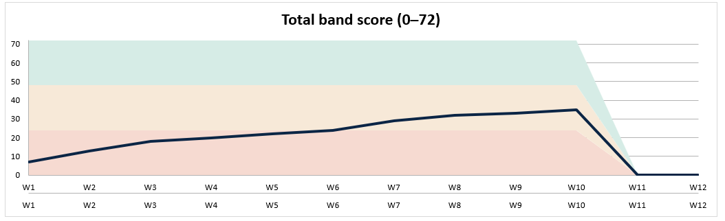
The SME tracker: twenty-four metrics entered weekly, each showing its benchmarked band.

Twenty-four metrics, every week

Type the week’s figures and each one lands in its band. Twelve weeks later you are not reading a number – you are reading a direction, per metric and per pillar.
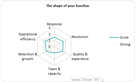
The pillar view: six pillar scores summarising twenty-four underlying metrics.

Six pillars, one screen

Twenty-four numbers is too many to hold at once, so the pillar view rolls them into six scores – with the underlying metrics one click away when a pillar looks wrong.
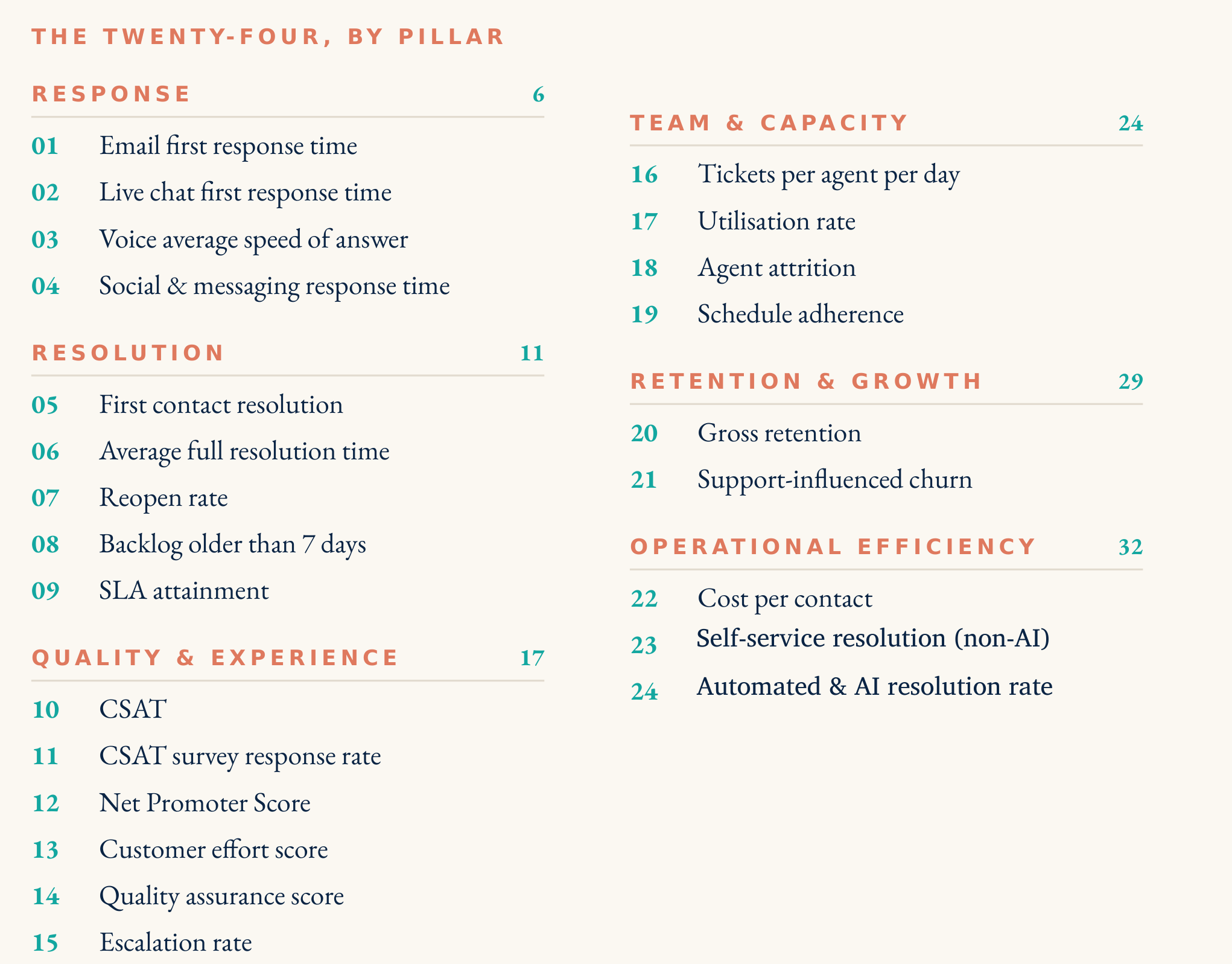
A page from the SME companion guide, explaining one metric and how to read it.

One page per metric

What each metric measures, why it matters at your size, how it fails quietly, and what to do when it slips. Written for the person who has to explain the number to someone else.

See it properly

The customer service dashboard for growing teams, on one tab

Not a mock-up. Six pillar scores across the top, then every metric on its own chart with its bands shaded behind it – so a strong pillar hiding a failing metric has nowhere left to hide.
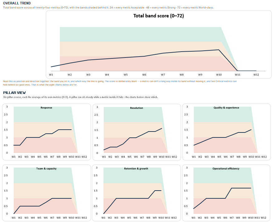
customer service dashboard for growing teams - 24 KPIs across six pillars

Why these twenty-four

The selection is the product

We run multilingual customer service operations for clients around the world. The twenty-four customer service KPIs are not a longer list than the eight – they are a different instrument, chosen for a function that has specialisation, shifts, tiers, and more than one language in play. Each metric earned its place on three tests: it is measurable from what you already have, it has a reliable link to what customers actually experience, and someone in your team can act on it without waiting for permission from another department.

Choosing these twenty-four, and grouping them into six pillars, is our judgement. Where the bands sit is not – those are benchmarked, then filtered for organisations of your size. A mid-market average quietly sets the bar in the wrong place for a forty-person function – which is how teams end up congratulating themselves for hitting a target that was never theirs.

What you are buying is not twenty-four numbers. It is knowing which twenty-four, how they group, and what “good” honestly looks like at your scale.

How it runs

Fifteen minutes a week, and a quarterly read

A dashboard nobody updates is worse than no dashboard, because it tells you a stale story with a straight face. So the rhythm is built to be survivable by a busy manager.
  1. Fill in the week’s column

    Twenty-four figures, most of which your tooling already reports. Leave what does not apply blank – a blank is honest information, not a failing.
  2. Read the pillars first

    Six scores tell you where to look. You only drop into the individual metrics for a pillar that has moved or is sitting in the wrong band.
  3. Act on one thing

    Not six. The dashboard exists to make the choice obvious, and a function that fixes one real thing a quarter compounds faster than one that half-fixes four.
  4. Re-read the quarter

    Twelve weeks of bands is where the trends live. This is the view you take to a board, a budget conversation, or a hiring case.

Honesty about fit

This is the wrong product for some people

We would rather lose the sale than have you open the file and find it is built for an operation you do not run.

Buy it if

  • You have roughly ten to eighty people in or around support
  • You own the function and have to justify its decisions to someone else
  • You suspect one pillar is carrying the score while another quietly fails
  • You want a defensible operating picture, not a monthly status slide

Do not buy it if

  • You are under ten people – the Solo Metrics Dashboard is the right-sized instrument, and cheaper
  • You want software that pulls the numbers automatically – this is a spreadsheet, and you type them in
  • You want a diagnosis of what to fix rather than a measure of where you stand – the CS Audit Kit does that job
  • Nobody in your team will own the fifteen minutes a week

The guarantee

If it shows you nothing you did not already know, we refund you

Thirty days. No form, no argument, no “what went wrong?” survey. One email and the money goes back.

And you keep the files. We cannot claw a spreadsheet back off your hard drive and we are not going to pretend otherwise – we would rather you kept a good opinion of us.

We can afford to say that because the product is good, and because €89 is not the point. A function of your size spends more than that on tooling in a week.

Before you buy

The questions people actually ask

How is this different from the Solo dashboard?

Solo is eight metrics for a team under ten, where one person is the support function. This is twenty-four metrics in six pillars for a team of ten to eighty, where the failures are spread across specialisms and no single person sees all of them. Different instrument, not a bigger version.

Excel or Google Sheets?

Both, and LibreOffice. It is an .xlsx file with no macros and no add-ons. Open it wherever your team already works.

Do we need a helpdesk tool to fill it in?

At your size you almost certainly have one, and most of the twenty-four come straight out of it. The few that do not – the ones about knowledge, capacity and quality – are the ones worth the manual count.

Can more than one person use it?

Yes. One payment, the files are yours, no per-seat pricing. Most teams have one owner who updates it and several people who read it.

Is this a subscription?

No. One payment, no renewal. You are probably comparing us to CS platforms at €30–€120 per user per month – this costs less than a single seat for a single month, once.

What if the dashboard tells us we have structural problems?

Measurement names the pattern; the fix is a different job. The CS Playbook (€129) installs eight pillars, template by template. The CS Operating System (€199) installs the operating layer above them – segmentation, health scoring, governance. Both are the natural next step when the dashboard shows you’re not just missing numbers, you’re missing process.

What if we are closer to a hundred people?

Past a hundred you are into different operating discipline entirely – enterprise CS ops. An Operating Review or a conversation about Support Solutions running the function with you is more useful than another download.

One decision

See the function, not just the tickets

Twenty-four numbers, six pillars, twelve weeks. Enough to stop guessing which half of your operation is carrying the other.

Get the dashboard — €89

One-time · Instant download · Excel, Sheets & LibreOffice · 30-day money back